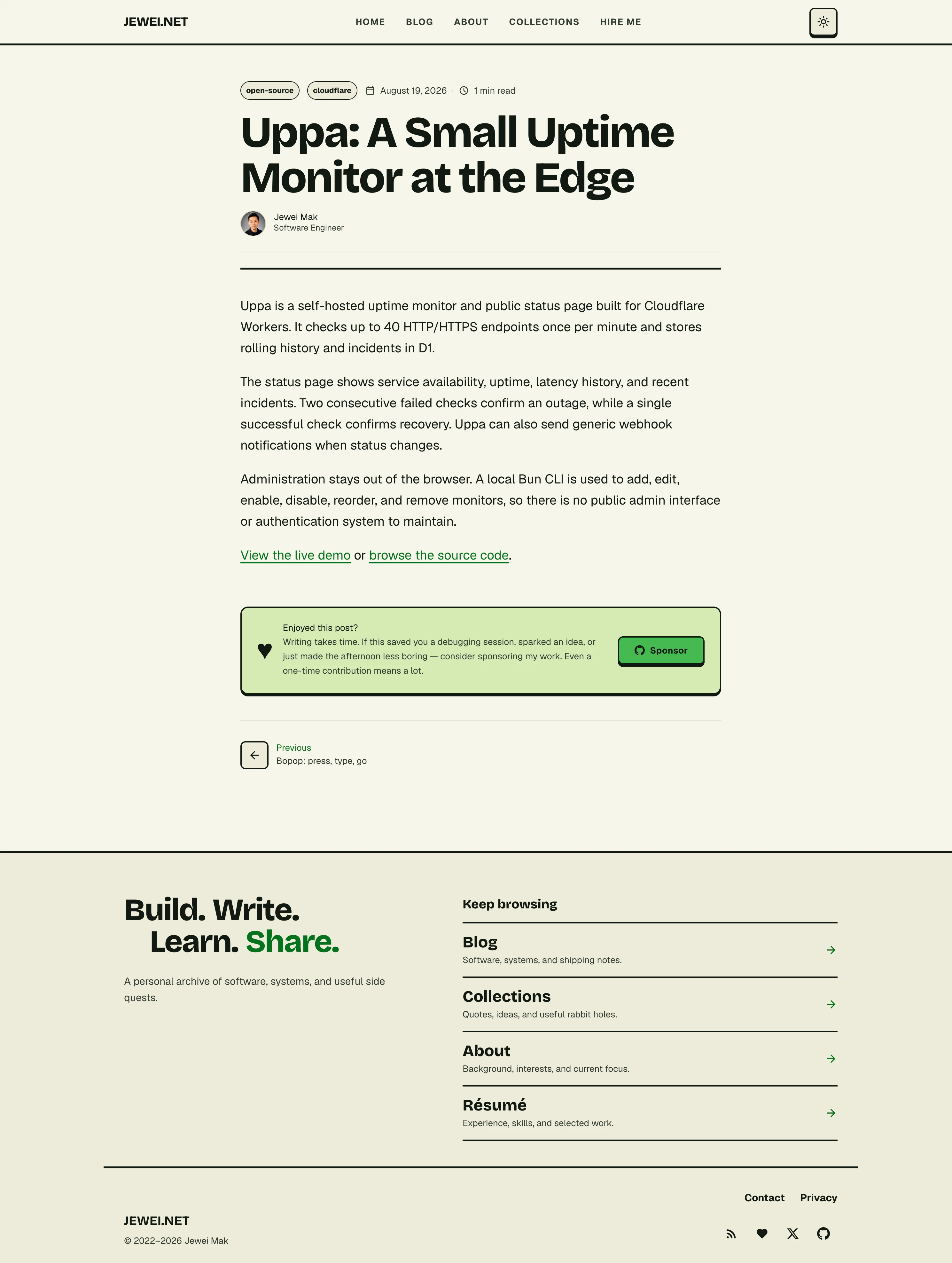
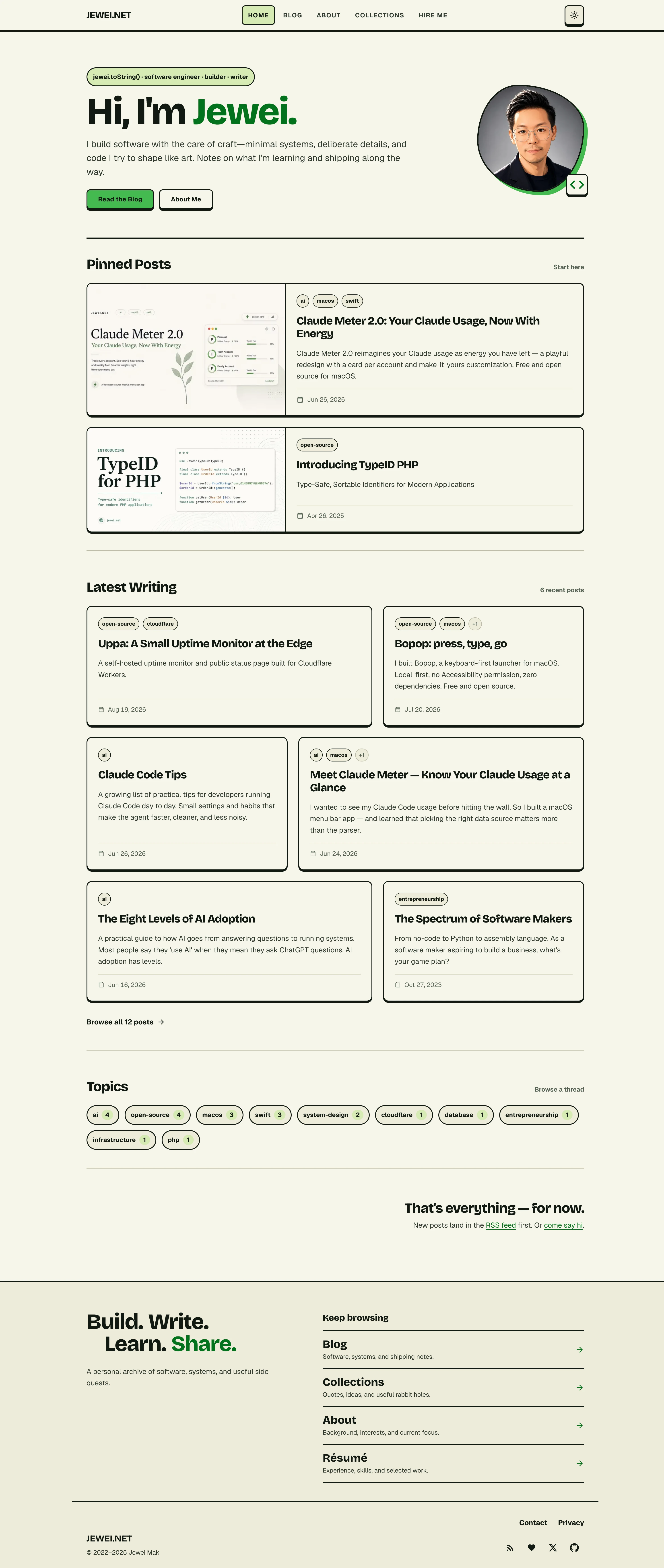
I changed the theme of this blog. The old design had thick borders, bright green buttons, and boxes around most posts. I wanted a simpler page, with more attention on the text.
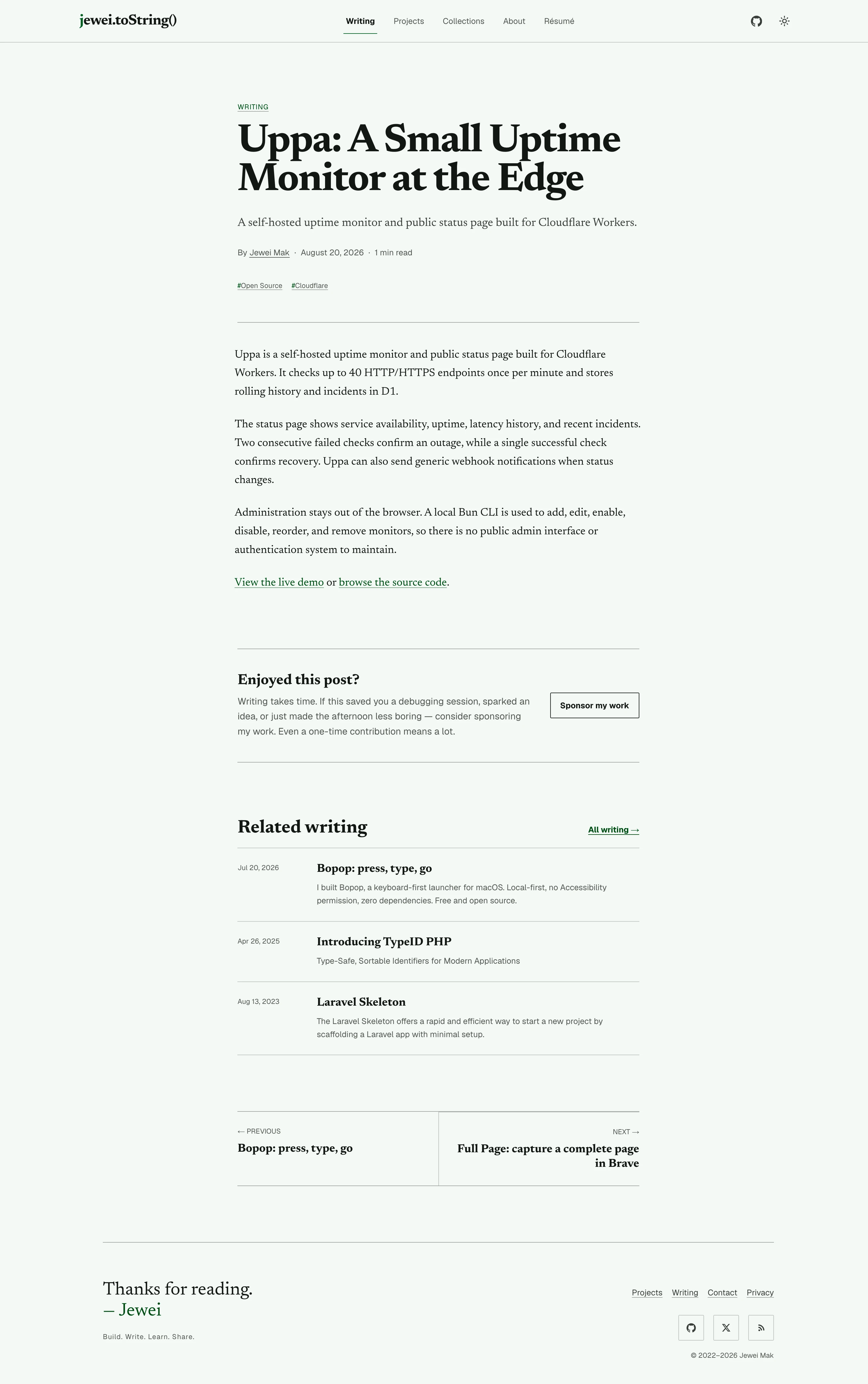
The new design takes its cues from a printed journal. Newsreader is the serif font for headings and articles. Thin lines separate sections, and a pale background replaces the cream one. Green stays, but mostly in links and small details. The familiar jewei.toString() now sits at the top of every page.
The home page has changed too. Selected projects now come before the posts, with previews and direct links to the code and downloads. Pinned posts and recent writing use plain rows. The projects page gives the things I build a place of their own.
Open any screenshot to see it at full size.
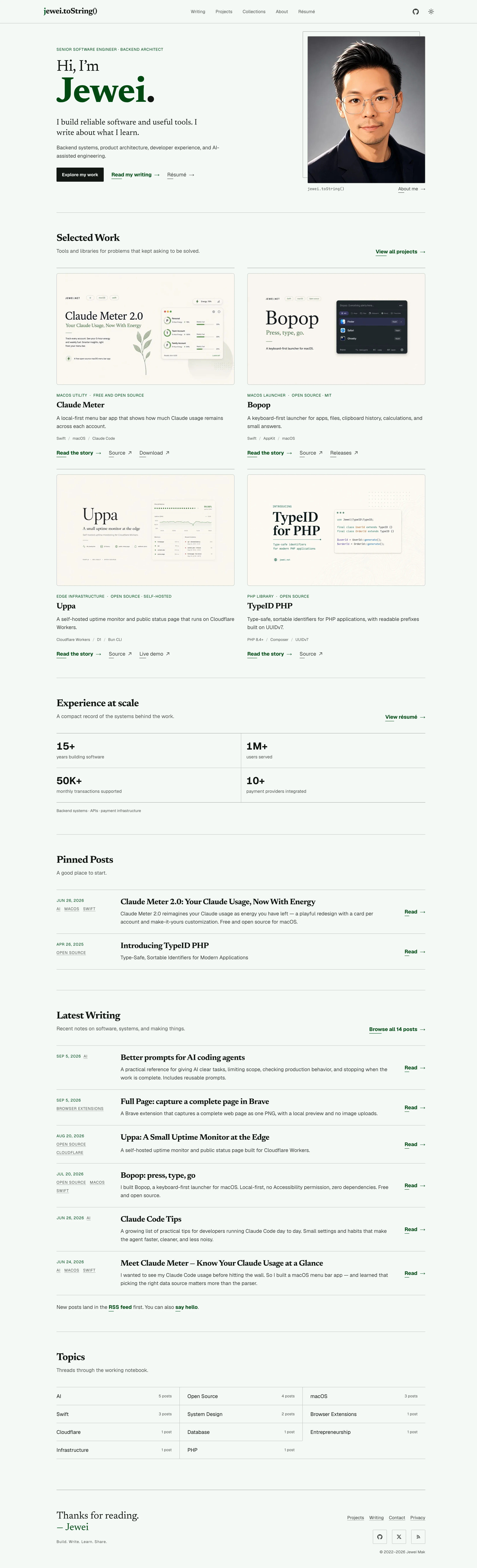
Articles now show a short description below the title, with related posts at the end. The about page and résumé use the same fonts and colours. The large footer has become a short sign-off.
Here is the same Uppa post in both designs.